
The capital N of NeuroBiogen’s CI represents
-
 Novel
New drug
-
 Nick
Fully healthy, stable body
which is in good nick -
 Nirvana
Being free from all
anguish and suffering
The CI of NeuroBiogen is a shape in which the capital letter N is surrounded by sky blue, blue, and navy blue, and the shape is again surrounded by navy blue. This symbolizes "THINK INNOVATIVE, MOVE TO PATIENT'S CENTRIC," which is the motto of NeuroBiogen to achieve sincerely and innovatively the most important elements for prosperous life and long living which are life, health, communication, wisdom, happiness, protection, hope and belief.

NEUROBiOGEN represents the growth engine of NeuroBiogen by combining the shape of water droplet
with BiO, which means water or blood that symbolizes human life.
BiO itself symbolizes life, health, and abundance by using sky blue, the corporate color
NEURO and GEN's navy blue color symbolizes leading and protecting sustainable life,
health and abundance with faith, hope and sincerity.




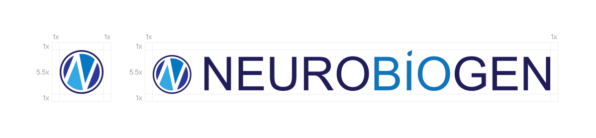
In order to maintain the formative characteristics of the NeuroBiogen signature, it is necessary to secure the required space or more than the Symbol mark space regulation when applying the company mark, as shown in the example below, with the minimum space to be separated from other elements. The use of background colors as well as auxiliary graphic elements should be avoided inside the Clear Space, positioning and securing of the Clear Space also should be preceded when developing the product.
-
NeuroBiogen Sky Blue
Symbolizes life, health, abundance and exchange
(R: 0, G: 176, B: 240) -
NeuroBiogen Blue
Symbolizes truth, faith, wisdom, happiness and protection
(R: 0, G: 112, B: 192) -
NeuroBiogen Navy Blue
Symbolizes sincerity, hope, belief and sacredness
(R: 0, G: 32, B: 96)
The designated font is used in various prints and promotional articles of the NeuroBiogen, such as sentences or headings, and is selected to make the visual image of the NeuroBiogen more consistent and uniform.
The designated font follows the basic elements of the CI system as well as what is presented to suit various application media.
-
Pretendard Extra BoldThe Designated font of NeuroBiogen is Pretendard
-
Pretendard BoldThe Designated font of NeuroBiogen is Pretendard
-
Pretendard RegularThe Designated font of NeuroBiogen is Pretendard
-
Pretendard LightThe Designated font of NeuroBiogen is Pretendard

- Add(06714) 2 FL, Bangbae BLDG, 9, Myeongdal-ro, Seocho-gu, Seoul, Republic of Korea
- Tel+82-70-4018-8009
- Fax+82-02-3486-2613
- E-mailneuro_reply@neurobiogen.com